Friday, 7 June 2013

Other Character Designs


Johnny - at one point in the begging of the book is described in great detail and is a character worth designing even if he is in the background for the most of the story because its a chance to show how all the younger children looked because they as a group at one point were also described in similar detail.

Books description of Johnny
  • six years old
  • clothes torn 
  • innocent looking 
  • face covered in fruit


Final Design


Simon
Final Design
Simon is not described much in the book, not in the first act anyway so his design was the most improvised. I imaged he would have thick messy hair from being sweetie in the hot environment  with his black uniform on were he eventually fainted. I also imagined because he befriends Ralphe and Piggy that he would generally have a friendly look to him which I think I was achieved with his round shaped face and his shy and nervous facial expressions.


Sam and Eric

Final Design
From what the book tells you about sam and eric they are described as very lively, young and a feel like they are always up to no good.  I looked to capture that in there wide eyes and constant smile. Ive also looked to convey a sense of energy to them in there wavy hair shape.

Page Experiment


Now that I have established my main characters and some of the objects I decided to do some experimenting by illustrating them into a bunch of random panels from my story board design. I think the characters have come out well and they look like they belong together in the same story. As for things like the background and surrounding it could do with some improvement. I think the detail and texture for the sand is fine but the jungle in the background of the first panel doesn't look at all impressive and shows I may need to do some experimenting with designing the background and environment.


I also did some experimenting by colouring in one of the panels digitally on photoshop. Im not too experienced with colouring in digitally so I just stuck to what I  know by using paint bucket over a scanned in image. Again this is something I need to experiment with more if I plan to colour in the novel digitally. Although I think I have got the colours right  to create the right atmosphere, the overall finish looks poor and low quality and if I plan to colour in my images digitally I will need to experiment with different techniques and approaches.

Designing Piggy


Description of Piggy in the book:

  • Short
  • Very fat
  • Wears glasses


Piggy from the 1963 and 1990 film adaptions of lord of the flies

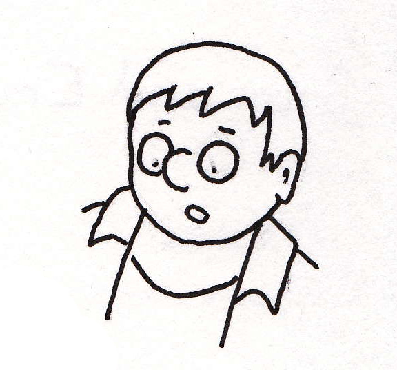
While this first design does distinctively look like piggy, the shape of the face doesn't have much emotion to it and it looks very cardboard.

the hair and shape of the face gives this design much more character but it doesn't quite seem solid enough of a design yet.

In this design I tried having piggies nose point up more to look like a pigs nose but the design just looks silly and out of place.

The design look much solid, by making the hair shorter and showing off the eye brows more gives a lot more emotion and character to the face.
 In this design I had the eyes show through in the glasses to see if that would add to the character more, but I find this design to look more cartoony and harder to take seriously compared to the previous design.
 Piggy with out glasses.
Another design of piggy without glasses, doesn't quite have the same chubby look to him than the design with the more circular eyes

I found drawing piggies body very difficult and was constantly rubbing out and drawing this image again and again trying to make him look fat. The problem with this image is piggys neck looks too thin and the shoulders dont look right, he looks more like a muscular boy and a fat boy.


Final Design

This design is a significant improvement and looks much more convincing buy giving him a shorter neck and widening and shortening things like piggys arms and legs. The five fingers still dont look right  still and I may draw the hands with four fingers instead for my graphic novel.

Thursday, 6 June 2013

Designing Jack


Jacks Description in the book:

  • Tall
  • Thin and Boney
  • Hed Hair
  • Freakily and ugly without silliness
  • Blue Eyes

Jack from the 1963 and 1990s film adaption


Designs


Final Design
When I was designing Jack I genrally wanted him to look unlikeable because when you read the book you get the idea hes not very pleasant to other people and treats them like they are a lesser person than him (especially Piggy). I think i've captured this look well with the pointy and sharp chin and nose almost having an evil look to him and the constant frown look to his face like hes judging you. Also like the book i think the face has a sense of ugliness and the shape of his tall skinny body is there. The only problem is I think you get a sense he is older that Ralphe or around the same age in this design but I dont think it looks too big of an age difference and I always imaged when reading the book that Ralphe and Jack were close to the same age.


Design for the Knife


Research of what a 50s pocket knife would look like

Images from:
https://svpply.com/item/160656/Vintage_Colonial_Prov_Fish_Knife
http://www.etsy.com/listing/41685805/kamp-king-1950s-1960s-pocket-knife-faux


Second set of designs


 The Conch
First Design


After I drew my first design of the conch I looked up a lot of visual images of conchs to practice drawing from because I didn't have a clear idea of what conch convincingly looked like.

Images from:
http://en.wikipedia.org/wiki/Conch
http://rateeveryanimal.com/2012/08/22/conch/
https://commons.wikimedia.org/wiki/File:Conch_shell_2.jpg


More designs


An illustration of Ralphe and Jack together comparing the two

Designing Ralphe


Ralphes description in the book:
  • Fair hair 
  • Oldest on the Island (12 years old)
  • Good looking
  • Relatively tall

Portrails of Ralphe in the 1963 film and in the 1990 film

From what I gathered I imagined Ralphe as the perfect kid, some one quite tall, well build for his age and older than everyone else. Theres also something easy going, laid back and full of energy about him especially from the scene he realised there was no adults on the island and straight away all he wanted to do was take off his uniform and go for a swim. I looked to try and convey these elements in my design of him.


First design. tried to be to complex with the nose, the chin is too pointy and the shoulders are to big for a 12 year old.

shape of the chin and body looks more fitting, but theres still too much thought put into the shape of the nose. I like the energy to him with the hair but this its a bit too spiky.


 Much better all round, theres a nice sense of energy in the shape of his hair without it feeling to exaggerated.

Looked at making the eyes more circular but I feel it makes him look too young when Ralphe needs to look like a boy but still look older that the rest of the children.


Redrew the third design again to get use to drawing its structure repeatedly.

Experimenting of drawing the body. Most of it looks okay apart from the arms that are too long and the five fingers look like they belong to an alien.


Final Design of Ralphe

Overall Im happy with this design, Ralphe has a friendly and likeable look to him and also looks commanding. There feels like a good sense of energy to him to give a good impression he is a kid.
The style I have picked up generally has a simple look to it, but I think it works well for a graphic novel considering I an going to be drawing him repeatedly in small panels and the simplicity in the face gives a nice personallity to it as well. It defiantly take inspiration from Jon McNaught and Isabel Greenberg work from how an image can be less detailed but more effective as a result.

Examples of Jon McNaught and Isabel Greenberg work again:


Experiment with shading, the texture looks interesting but takes away from the focus on the face


Story Board Design


I decided to end up my story hear because I am already up to 14 pages and if I was to add the rest of the 1st act I would need to cut down on detail of what I have so far so the work load isn't too much. I also dont think I should cut down on what I have so far because I think was I have is pretty solid and it would look heavily uneven to speed up on certain scenes considering the pace of my novel and its dialogue. I also noticed by this point I had finished the first chapter of the book and thought this would be a fitting way to wrap up.