Ralphes description in the book:
- Fair hair
- Oldest on the Island (12 years old)
- Good looking
- Relatively tall
Portrails of Ralphe in the 1963 film and in the 1990 film
From what I gathered I imagined Ralphe as the perfect kid, some one quite tall, well build for his age and older than everyone else. Theres also something easy going, laid back and full of energy about him especially from the scene he realised there was no adults on the island and straight away all he wanted to do was take off his uniform and go for a swim. I looked to try and convey these elements in my design of him.
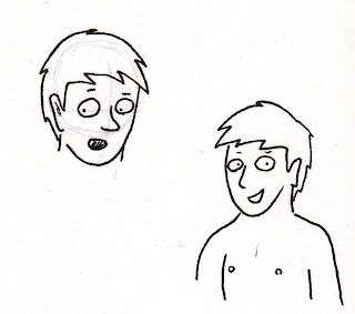
First design. tried to be to complex with the nose, the chin is too pointy and the shoulders are to big for a 12 year old.
shape of the chin and body looks more fitting, but theres still too much thought put into the shape of the nose. I like the energy to him with the hair but this its a bit too spiky.
Much better all round, theres a nice sense of energy in the shape of his hair without it feeling to exaggerated.
Looked at making the eyes more circular but I feel it makes him look too young when Ralphe needs to look like a boy but still look older that the rest of the children.
Redrew the third design again to get use to drawing its structure repeatedly.
Experimenting of drawing the body. Most of it looks okay apart from the arms that are too long and the five fingers look like they belong to an alien.
Final Design of Ralphe
Overall Im happy with this design, Ralphe has a friendly and likeable look to him and also looks commanding. There feels like a good sense of energy to him to give a good impression he is a kid.
The style I have picked up generally has a simple look to it, but I think it works well for a graphic novel considering I an going to be drawing him repeatedly in small panels and the simplicity in the face gives a nice personallity to it as well. It defiantly take inspiration from Jon McNaught and Isabel Greenberg work from how an image can be less detailed but more effective as a result.
Examples of Jon McNaught and Isabel Greenberg work again:
Experiment with shading, the texture looks interesting but takes away from the focus on the face


No comments:
Post a Comment