Description of Piggy in the book:
- Short
- Very fat
- Wears glasses


Piggy from the 1963 and 1990 film adaptions of lord of the flies

While this first design does distinctively look like piggy, the shape of the face doesn't have much emotion to it and it looks very cardboard.

the hair and shape of the face gives this design much more character but it doesn't quite seem solid enough of a design yet.

In this design I tried having piggies nose point up more to look like a pigs nose but the design just looks silly and out of place.

The design look much solid, by making the hair shorter and showing off the eye brows more gives a lot more emotion and character to the face.

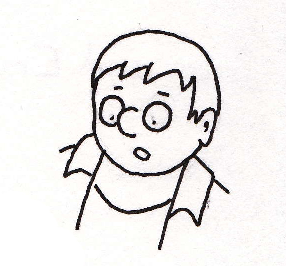
In this design I had the eyes show through in the glasses to see if that would add to the character more, but I find this design to look more cartoony and harder to take seriously compared to the previous design.
Piggy with out glasses.

Another design of piggy without glasses, doesn't quite have the same chubby look to him than the design with the more circular eyes

I found drawing piggies body very difficult and was constantly rubbing out and drawing this image again and again trying to make him look fat. The problem with this image is piggys neck looks too thin and the shoulders dont look right, he looks more like a muscular boy and a fat boy.

Final Design
This design is a significant improvement and looks much more convincing buy giving him a shorter neck and widening and shortening things like piggys arms and legs. The five fingers still dont look right still and I may draw the hands with four fingers instead for my graphic novel.
No comments:
Post a Comment